
Influencer Media Kit: The Complete Guide for Creators in 2026
If you've ever sat down to put together a media kit, you've probably stared at a blank Canva template for an hour and given up. I get it. I talk to creators every week who say the same thing: they know they need one, they have no idea what's actually supposed to go in it, and the examples they find online either look like resumes or like they were made by a fashion magazine.
This guide is the version I wish existed. It walks through what a media kit actually is, what to put in it, what to leave out, and how to make one that brands will actually open.
What is a media kit, really?
A media kit is a one-pager (sometimes two) that tells a brand who you are, who follows you, what you've made, and why you're worth working with. That's it. It's not a portfolio. It's not a resume. It's a pitch.
The mistake most creators make is treating it like a comprehensive document about their entire career. Brands don't read those. The marketing manager you're trying to reach has 40 other tabs open. Your job is to give them the three things they need in 15 seconds, then make it easy for them to say yes.
For more on the bigger picture of getting brand deals in the first place, I wrote a practical guide to getting brand deals as a creator that pairs well with this one.
What actually goes in a creator media kit
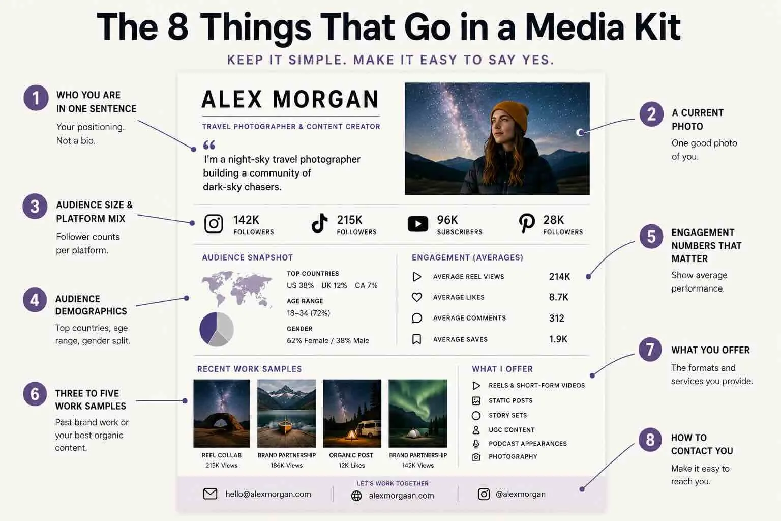
Here's the short list. Every media kit should have these things and ideally not much more:
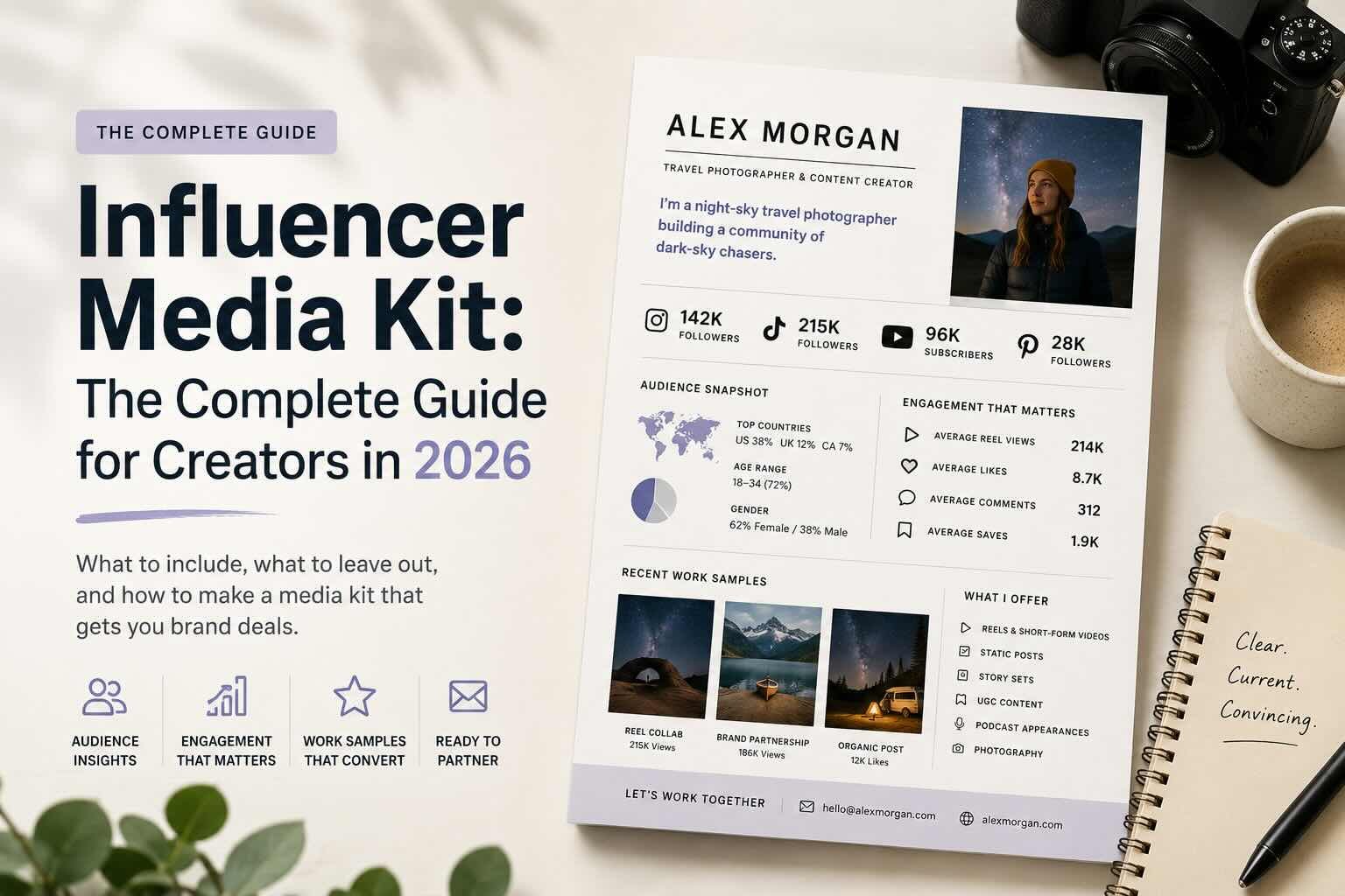
1. Who you are in one sentence. Not a bio. A positioning line. "I'm a night-sky travel photographer building a community of dark-sky chasers." If you can't write yours in one sentence, the rest of the kit won't save it.
2. A current photo. One good photo of you. Not five.
3. Audience size and platform mix. Follower counts per platform, listed clearly. No screenshots of analytics dashboards. Just the numbers.
4. Audience demographics. Top three countries. Age range. Gender split if it's relevant. Don't overdo this. Brands want to know if your audience matches their customer, not your full census data.
5. Engagement numbers that matter. Average views per post, average likes, comments, saves. Pick the metrics that actually represent how your content performs. If your reels average 200K views, that's the number to lead with, not your follower count.
6. Three to five work samples. Past brand partnerships if you have them. If you don't, your three best organic posts. Show, don't tell. This is the section brands actually scroll back to.
7. What you offer. Reels, static posts, story sets, UGC, podcast appearances, whatever you do. Be specific.
8. How to contact you. An email, ideally not your personal one. A link to your site or booking page if you have one.
That's the entire kit. If you find yourself adding a ninth section, you're probably padding.
What to leave out
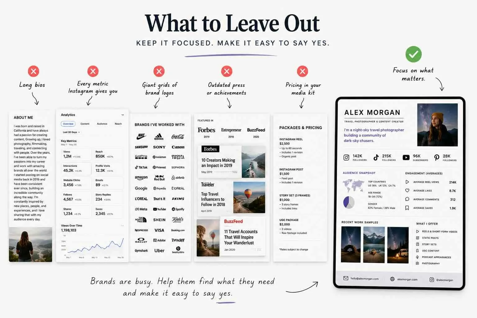
Most media kits I see are bloated. Here's what to cut:
Long bios. Save the autobiography for your About page.
Every single metric Instagram gives you. Pick the relevant ones.
Logos of brands you've worked with in a giant grid. One row of three is enough.
Press mentions that are five years old.
Pricing. I'll get into this below.
Should you put your rates in your media kit?
This is the question I get the most. My honest answer: usually no, but it depends.
If you put a rate card in the kit itself, you anchor every conversation to that number. Sometimes that's good (you screen out brands who can't pay). Sometimes it costs you money (the brand had a bigger budget than your rate and you just told them to spend less).
The version I recommend for most creators: keep your rates in a separate one-pager you send after the brand expresses interest. That way the media kit gets you in the door, and the rate card moves the conversation forward. I'll write more about pricing in a follow-up post, but for now the heuristic is: lead with what you offer, not what it costs.
How to actually make one
You have a few options. Canva templates are free, customizable, and look fine, but they all look the same, which means brands have seen yours before they open it. Figma or Adobe give you more control if you have design chops. There are also purpose-built tools (Trovio included) that pull from your social data automatically so you're not rebuilding it from scratch each time.
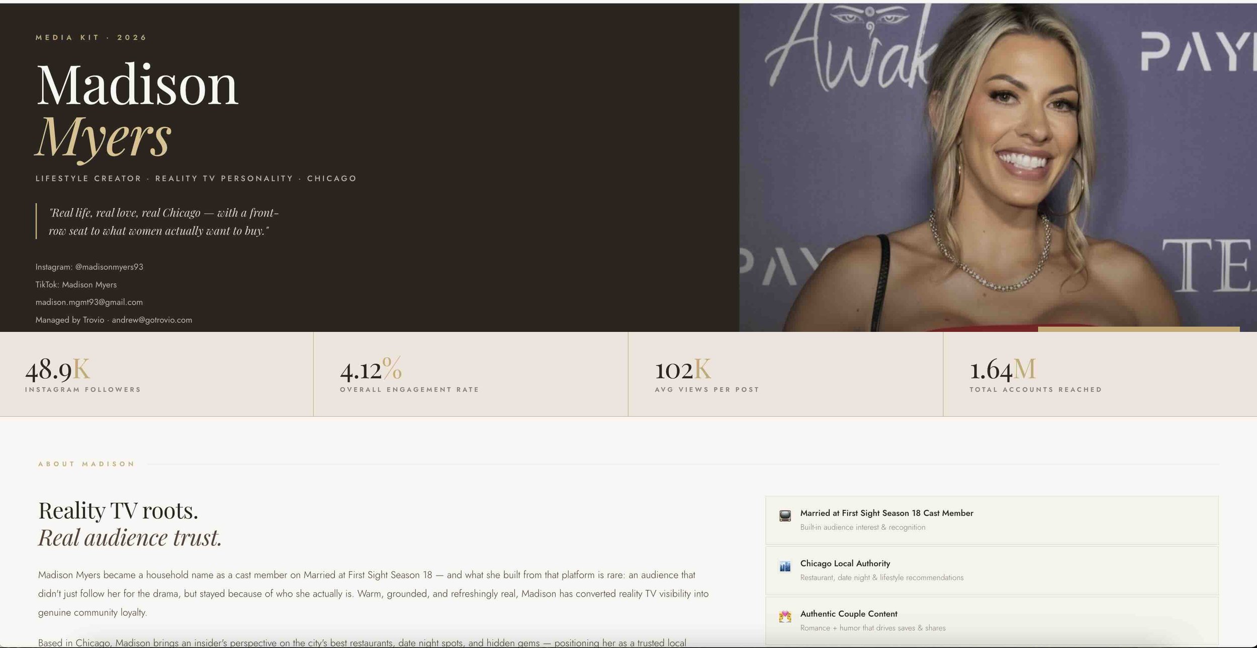
A real Trovio Media Kit Example
Whichever path you pick, the principle is the same: clean, current, easy to skim.
A few things brands actually look for
I've spent the last year talking to brand-side marketers about what they actually use media kits for. The pattern is consistent:
They check audience match first. Country, age, niche.
They scan engagement, not follower count.
They look at the work samples to see if your aesthetic fits theirs.
They check if you've worked with anyone in their category before.
They look for a reason to say yes in under a minute.
If your media kit makes any of those five things hard to find, brands will close the tab. The point of the kit is to get to a meeting, not to win a design award.
Update it. Then update it again.
A media kit from six months ago is a liability. Your follower counts are different. Your engagement is different. The brands you've worked with are different. If you're sending a stale kit, the brand can tell, and it makes you look less serious than you actually are.
The single biggest upgrade most creators can make to their media kit is just keeping it current. Set a recurring reminder to refresh it every 30 days. Or have your Trovio agent manage this for you, keep it updated, and keep it pointed in the right direction.
The takeaway
A great media kit isn't a long document. It's a clear one. It tells a brand who you are, who's listening, what you've made, and how to work with you. Everything else is decoration.
If you've been putting yours off, today's the day. Open a doc, write your one-sentence positioning line, and start there. You can build the rest in an hour.
For more on what you should actually charge once those conversations start, I wrote about how much to charge for a brand deal that goes deeper on the pricing side.